Seren
A Meditation App Design for enhancing well-being
Introduction
What is Seren, and how can it enhance your well-being?
In today’s fast-paced world, mental health and well-being are more crucial than ever. In response to this growing need, as a student in UXland, I decided to create a meditation app called Seren as a concept project.
The app focuses on providing personalized meditation experiences using AI technology to help people find calm and balance.

Project Overview
Duration
3 Months
team
Group of 3
Role
UX/UI Designer
Tools
Figma, Illustrator, Maze
Duration
3 Months
Role
UX/UI Designer
team
Group of 3
Tools
Figma, Illustrator
Problem Discovery
Maintaining a consistent meditation practice is challenging due to lack of personalization and motivation.
Through early interviews with potential users, many expressed difficulty maintaining meditation routines. They often started but quickly abandoned their practice, overwhelmed by cluttered designs and complex features.
Business Goals
The goal is to increase user retention by offering personalized meditation experiences tailored to individual stress triggers and preferences.
The business also wants us to provide a calm, minimalist experience, focusing solely on meditation.
Design Process
Mapping Out My Design Journey
In this project, I applied the Design Thinking process, a user-centered, iterative approach to deeply understand user needs and continuously refine the app’s design for optimal usability and engagement.
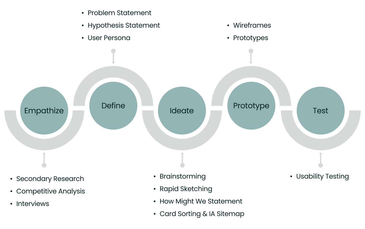

1. Empathize
How did I understand the users?
To truly grasp what users need, I delved into three key research activities:

Secondary Research

Competitive Analysis

User Interviews
To truly grasp what users need, I delved into three key research activities:

Secondary Research

Competitive Analysis

User Interviews

Secondary Research
Exploring Existing Insights
I reviewed articles about personalization in meditation apps, user engagement strategies, and habit challenges.
I reviewed articles about personalization in meditation apps, user engagement strategies, and habit challenges.
Takeaways from Reviewing Articles
High-quality contents boost engagement.
Guided practices and structured programs deepen meditation.
Effective use of gamification enhances retention.
Meditation is most effective when tied to daily routines, with cues like notifications prompting engagement.
AI-driven personalization increases satisfaction.
Mood trackers and targeted tools address mental health needs.
I analyzed 200+ user reviews from Google Play, the App Store, and Reddit to uncover insights.
I also analyzed 200+ user reviews from Google Play, the App Store, and Reddit to uncover insights.
Takeaways from User Reviews
Challenges and Pain Points: Users frequently mention issues such as repetitive contents and lack of guidance for beginners.
Positive Feedbacks: Users appreciate diverse meditation options, offline access, and progress-tracking features.
Negative Feedbacks: Common dislikes include complex interfaces.

Competitive Analysis
Analyzing Competitors
I conducted a preliminary SWOT analysis of three meditation apps—Calm, Insight Timer, and Oak—before user interviews to build a foundational understanding of the product and identify key areas to explore further.
This helped me create targeted interview questions, align with business goals, and ensure that user research was focused and strategic.

Calm’s Personalization highlighted the importance of customizable meditation experiences, informing interview questions on user preferences for customization.
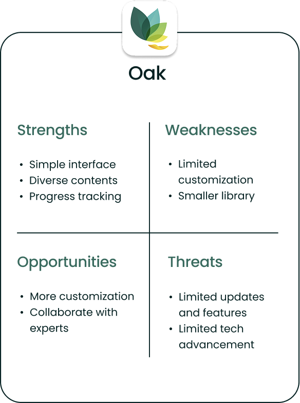
Oak’s simplicity emphasized a user-friendly interface, leading to questions about app navigation and content organization.
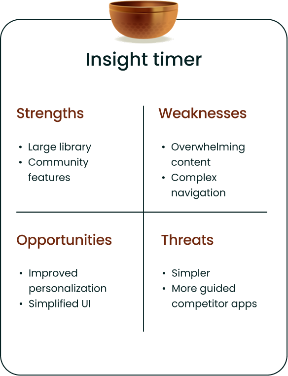
Insight Timer’s complexity showed the need to avoid overwhelming users, shaping questions on how to present a wide range of contents.

User Interview
Discovering Insights from User Interviews
I conducted Zoom interviews with 6 participants (ages 25-40) who had used meditation apps, using open-ended questions to encourage in-depth discussions. The goal was to uncover their motivations, challenges, and expectations.
“I like having different meditation styles to choose from. It keeps my practice interesting and tailored to my needs.”
– Sahar, mindfulness enthusiast
“I prefer an app that’s straightforward. Too many features can be overwhelming, so a clean design really stands out.”
– Pouya, busy professional
Key Takeaways
1. Customizable options like session lengths, meditation styles, and background music were essential.
2. A minimal, easy-to-navigate interface was highly valued, with everything clearly categorized.
3. Enough use of gamification elements like badges and points were seen as additional motivators.
“I like having different meditation styles to choose from. It keeps my practice interesting and tailored to my needs.”
– Sahar, mindfulness enthusiast
Key Takeaways
1. Customizable options like session lengths, meditation styles, and background music were essential.
2. A minimal, easy-to-navigate interface was highly valued, with everything clearly categorized.
3. Enough use of gamification elements like badges and points were seen as additional motivators.
“I prefer an app that’s straightforward. Too many features can be overwhelming, so a clean design really stands out.”
– Pouya, busy professional
2. Define
How did I synthesize research findings?
Affinity Diagram
Organizing Interview Insights
User Goals

Takeaway: Manage stress, improve emotional well-being, and enhance sleep quality.
Motivation Drivers

Takeaway: Progress tracking, rewards, and fresh updates.
App Navigation Challenges

Takeaway: Overwhelming navigation, repetitive content, intrusive notifications, lack of offline access.
Customization Preferences
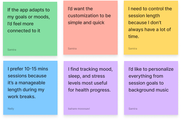
Takeaway: Personalized sessions, background sounds, quick and simple customization aligned with moods and goals.
Desired Features

Takeaway: Guided meditations, progress tracking, fresh content and practical tools like reminders and schedules.
User Persona
Representing Our Target Audience
The insights gained from research helped me identify patterns and pain points, enhancing my empathy for users. These insights guided the creation of user personas.


Emily Davis
Age: 36
Job Title: Software Engineer
Status: Single
Location: San Francisco, CA
I need a meditation app that fits my schedule and feels personal to me.
About
Emily enjoys coding challenges, but the tech world can get crazy. To relax, she hikes California’s trails. Despite her hectic job, Emily focuses on self-care, finding ways to chill and stay balanced.
Goals
- Relieve stress quickly without disrupting her workflow.
- Improve focus and emotional balance with goal-specific meditation sessions.
- Build a consistent self-care routine that feels rewarding and easy to maintain
Needs
- Customizable meditation options for session length, style, and sounds.
- High-quality guided meditations.
- Progress tracking for consistency.
- Offline access for travel flexibility.
Pain Points
- Repetitive content in existing apps quickly loses her interest.
- Cluttered interfaces and poor navigation waste her time.
- Intrusive notifications and upselling disrupt her experience.
Current Feeling

- Overwhelmed
- Motivated to find the right solution
Problem Statement
Defining the Problem
Users struggle to establish a consistent meditation habit due to:
- Lack of motivation
- Feeling overwhelmed by numerous features
- Navigating complex and cluttered designs
They often experience pressure from excessive challenges or gamification elements, leading to stress instead of relaxation.
Hypothesis Statement
Crafting the Hypothesis
If I design a meditation app with:
- streamlined, user-friendly interface
- minimal yet meaningful features
- gentle motivational tools
Then users will find it easier to build a consistent meditation habit, feel less overwhelmed, and experience relaxation rather than pressure.
3. Ideate
What solutions did I explore?
HMW Statements & Potential Solutions
Crafting Creative Solutions
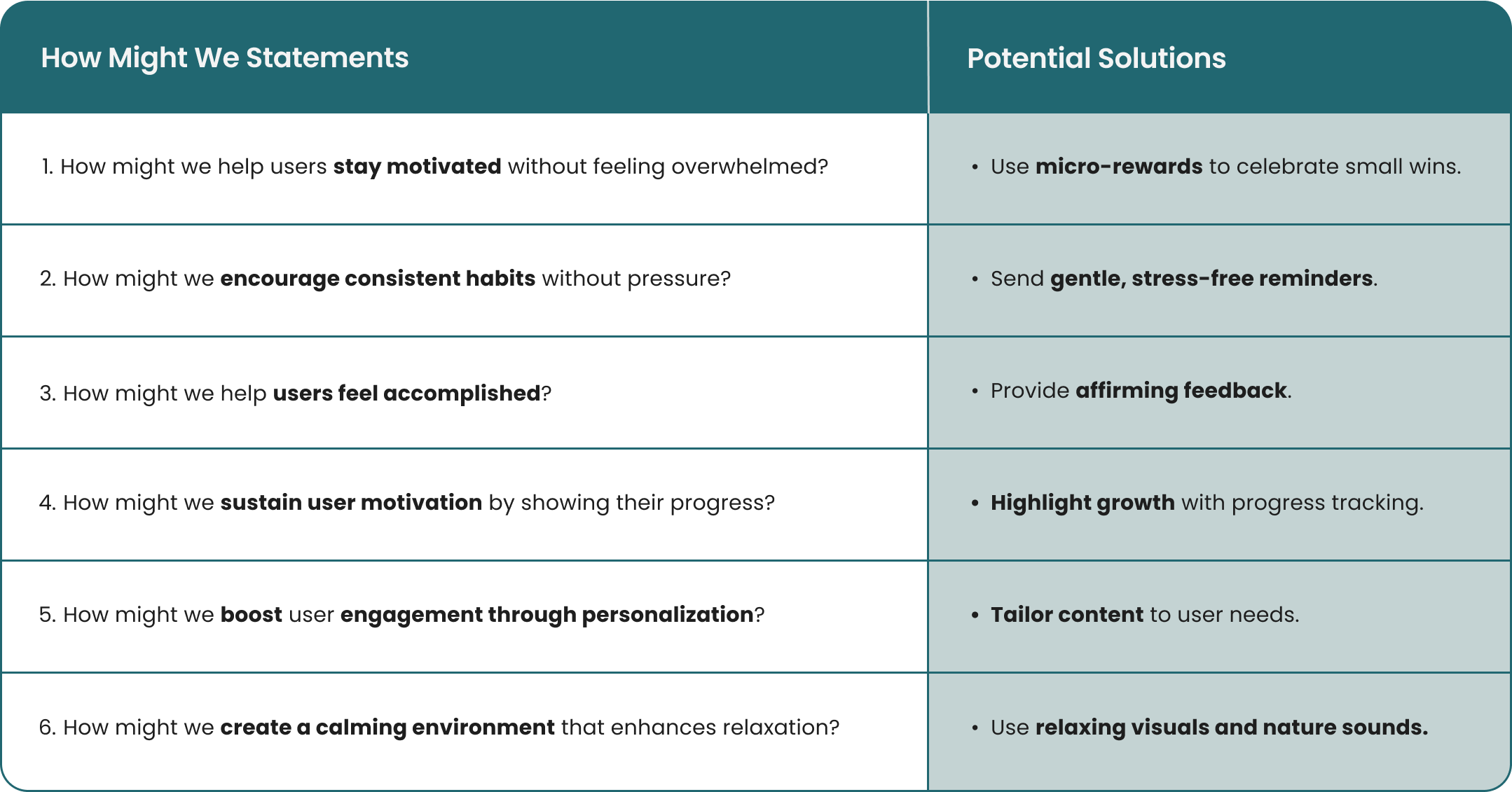
To address user needs and pain points, I created How Might We (HMW) statements and potential solutions, aim to enhance user motivation, engagement, and relaxation while reducing overwhelm and pressure.

Rapid Sketching (Crazy 8)
Sketching Engaging Homepage Ideas
To explore solutions for the HMW statements, I employed the Crazy Eights technique, a rapid sketching exercise where you fold a sheet of paper into eight sections and sketch a different idea in each, all within a set time limit. This method enabled me to brainstorm and visualize a wide range of ideas quickly.

Rapid Sketching for the Homepage

Rapid sketching for the homepage
Cart Sorting
Arranging Contents for Better Navigation
After the Crazy 8s activity, I did an closed card sorting session with 12 participants. This helped me understand how users group features and what they expect. These insights will help me design a site map that makes sense to them.


Site Map
Structuring Our App Layout
I developed a site map based on user research to ensure the app is intuitive and easy to navigate, reflecting how users expect to find features.


Task & User Flow
Journeying Through User Tasks
Task and user flow illustrate the steps users take to create a personalized meditation session, ensuring the app provides a smooth and intuitive experience.


Above is the Task Flow & below is the user Flow
4. Prototype
How did prototypes influence my design decisions?
Mid-Fidelity Wireframes
Refining Wireframes Based on User Feedbacks
In the Prototype phase, I developed mid-fidelity wireframes to visualize the app’s layout and functionality. I then performed usability tests, identifying and addressing challenges to improve our designs.


Mood Board & UI Kit
Bringing My Design to Life
Our path to the perfect palette
- We initially chose a mix of purples, turquoise, and green.
- Usability tests showed these colors felt too playful and not calming enough.
- Tried darker tones like deep purple and dark green, but users found them depressing.

Why Green?
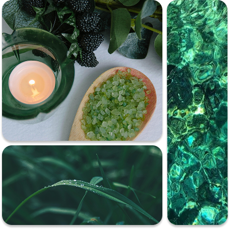
- Inspired by nature, we switched to various shades of green.
- Green tones provide a sense of calm, balance, and a minimalist feel, aligning with our meditation app’s goal.

Typography
We chose the Poppins typeface for a friendly, modern feel and used a consistent icon set for harmony.
Aa
Poppins Medium 20pt
Poppins Medium 16pt
Poppins SemiBold 14pt
Poppins Regular 12pt

Color Accessibility
I also used the WebAIM Contrast Checker to ensure our colors meet accessibility standards.
- All combinations passed the required contrast ratios, with scores of 5.88:1 and 4.55:1.
- This ensures our design is clear and readable for everyone.


Our path to the perfect palette
- We initially chose a mix of purples, turquoise, and green.
- Usability tests showed these colors felt too playful and not calming enough.
- Tried darker tones like deep purple and dark green, but users found them depressing.

Why Green?
- Inspired by nature, we switched to various shades of green.
- Green tones provide a sense of calm, balance, and a minimalist feel, aligning with our meditation app’s goal.

#F2EFEA

#1E6470

#092325

#487175

#258C9B
Aa
Poppins Medium 20pt
Poppins Medium 16pt
Poppins SemiBold 14pt
Poppins Regular 12pt
Our UI Kit reflects the calming green tones from our mood board. We chose the Poppins typeface for a friendly, modern feel and used a consistent icon set for harmony.
Color Accessibility
I also used the WebAIM Contrast Checker to ensure our colors meet accessibility standards.
All combinations passed the required contrast ratios, with scores of 5.88:1 and 4.55:1.
This ensures our design is clear and readable for everyone.

5. Test
How did usability testing impact my high-fidelity wireframes?
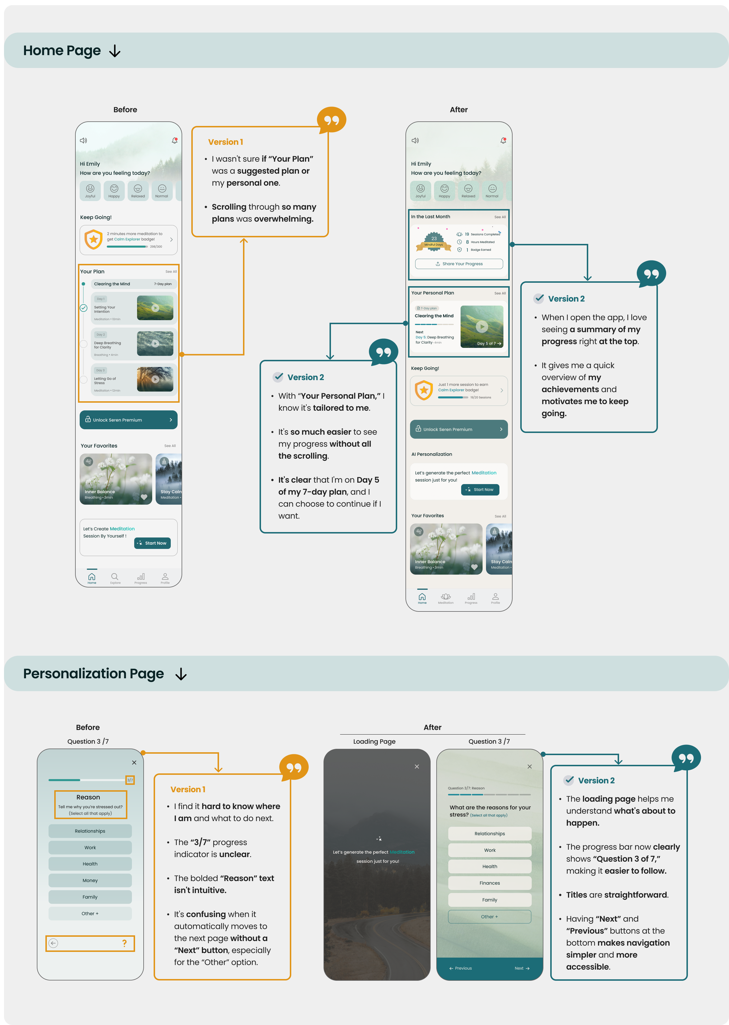
Iterations from Usability Tests
Refining Designs with User Insights

The Final Product
Unvailing the Final Design


Reflection
Learning from the Project Journey
What did I learn?
Working on this project emphasized the importance of clear team communication and early feedback.
Starting with a strong design foundation made iterations smoother and more efficient.
What can I do next?
Conduct additional usability tests to refine this version and incorporate more feedback.
Ensure accessibility by testing with diverse user groups and incorporating features like voice guidance and adjustable font sizes.
Figma Prototype
Thank You for Making It This Far!

